WEBSITE PRODUCTION
See "Website Draft Ideas" for my initial ideas for the website. Things have changed quite significantly from then to now, but some of the original ideas are still in place.
HOME PAGE
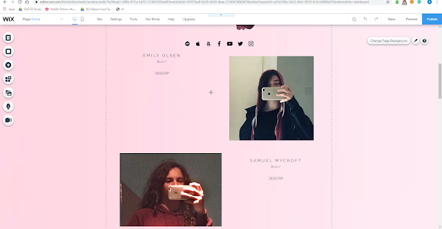
In the screenshot below, we can see multiple things that have stayed the same from the draft sketch I came up with on the 30/09 - the layout scheme, with the main body of the website and the image and description is almost identical. The images from Emily and Sam are similar to create a harmonic tone to Neslo and their artist unity. This screenshot was one of the first I had taken since I started with creating the draft. Over times, things slowly started to change, for example the gradient background with the Neslo symbol backing it. Now and in the final there is only a light pink, and this colour scheme suits it throughout, including certain filters in images and text colours complimentary. Also, it is to be noted that the images I used of Emily and Sam were also chosen for the minimalistic pop look with the straight lines created by background - i.e the door frame in Emily's profile and the wall curve in Sam's. These photos remained the same for these two reasons.
There are quite a lot of features in this screenshot that are different from the original draft. The first one is the menu bar - previously I had it below "NESLO" and named "artist" and "single" but now is "Home" and "Single", which I think I shall keep. The next big thing is the image of Emily sat beside a brook. There is some work to be done on this due to the profanity on the wall beside her. however this should look relatively similar at the end of the production. Another difference here is also that the main body of the website is supposed to be a light grey in contrast to the pinks beside it, but I decided to outline this instead with a stranded black separating line beneath the two black Neslo symbols. This gives it some form and some structure, whereas without it there would just be floating texts and images on the page. This replaces the greyish body I planned on in the first place, but still gives it some recognition to pop-culture, with contrasting and striking colours, jarring images (the motion blur, upsidedown image) and recognisable logo.
This screenshot has a few significant changes from the beginning draft to now, and there are still a few things that need to be completed. Firstly, the draft sketch of the website, there was only a "what we stand for" section left and the AV content. While the AV content is finished and uploaded, it doesn't take up the whole body of the website like in the draft, and the "what we stand for" section is replaced with the newest single and the discography, alongside basic info on the artist. The pop-like minimalistic small font is continuing to make its appearance throughout, creating an iconic look for Neslo. The things that will need to be changed in this section are two images: the first one being the album cover for Shine (the single) and the second album cover in the discography as I did not use images that were my own. The AV content was made prior to the website so this will not change, this is also immediately played when the viewer clicks on the site.
In fairness, this part is quite similar to the draft, although the images are below the AV content instead of above it and there is a representation box as well as a contact box, which really just ties it all together and puts this first page to a close.
SINGLE PAGE
To be honest, I completely scrapped the 2nd draft after completing the first page. The only similar things in this page to the draft is the second AV content and the Music Video. The reason why I didnt include behind the scenes images in this page is because I thought it unfair for when the next single came out they would disappear from the page and replaced with new ones. While it seemed like a good filler when I made the draft post, realistically that's all it was - filler. Instead, I took inspiration from the first page and used that as a template draft for my second. So, in this page you will find an identical structure of header, tag, separating line, image main body of website. This was useful to follow because prior to this screenshot was this:
which just looks so empty and meaningless, but after I added the image and "SHINE" with its summary it felt so much more.. Neslo. Furthermore, the image is a GIF which directly relates to the demographic we are aiming at - shooting at a 16-25 year old fun loving audience who know exactly what type of image this is. The only thing to be changed here is the Music Video needs to be added. Unfortunately, I didn't have enough time or footage to create the Behind The Scenes so instead of that I will have to add the representation and contact info from the other page.
Aside from the changes I mentioned, and future changes, this website should stay almost identical to now as I'm happy with how everything is looking. I think it lives up to the standard pop connotations etc.


Comments
Post a Comment