Posts

FINAL MUSIC VIDEO

https://youtu.be/dAsau-7_7FA

STORY BOARD X2

Image

VIDEO PRODUCTION and COMMENTS ON DRAFT

Not going to lie, I've changed so much here. Only when I came to film did I realize I missed a whole minute of storyboard and labeled one box "FILLERS". So, when it came to filming, I filmed all I could and arranged a comedic yet pop narrative and remade the storyboard afterward. - Firstly, I started with the credits, adding them before the music video starts. This created easy access into the video from the fade-out of Sony to the fade-in of the video beginning. As I kept editing through the footage I was filming, it came to my attention that I anticipated the shots to be longer than what they should be. Coming to editing, most shots were a second or two too long to look good - they lingered past their screen time and it bothered me. This was a problem because there are specific points in the song that have perfect edits to the beat and there was often a five-second gap before that and it wasn't acceptable. This is a major point in my editing process as without

WEBSITE PRODUCTION

Image
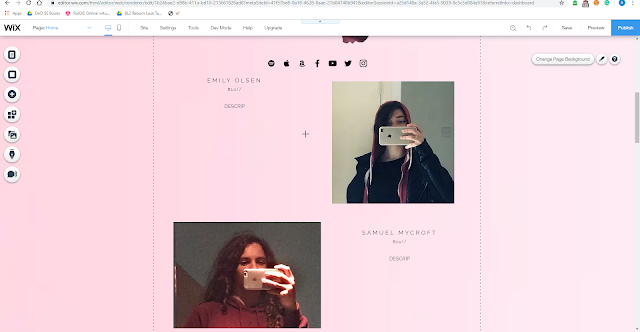
See "Website Draft Ideas" for my initial ideas for the website. Things have changed quite significantly from then to now, but some of the original ideas are still in place. HOME PAGE In the screenshot below, we can see multiple things that have stayed the same from the draft sketch I came up with on the 30/09 - the layout scheme, with the main body of the website and the image and description is almost identical. The images from Emily and Sam are similar to create a harmonic tone to Neslo and their artist unity. This screenshot was one of the first I had taken since I started with creating the draft. Over times, things slowly started to change, for example the gradient background with the Neslo symbol backing it. Now and in the final there is only a light pink, and this colour scheme suits it throughout, including certain filters in images and text colours complimentary. Also, it is to be noted that the images I used of Emily and Sam were also chosen for the min

WEBSITE DRAFT AND CHANGES

Image
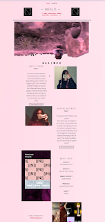
The images above are the first drafts of my website. Clearly, some work needs to be doing. Firstly, I need to add the behind the scenes video, and the music video itself! This will be done when they have been completed fully, which should be on the 1st of November. Secondly, I need to add the bios for my artist - where it says Download Bio, I haven't written the bio up yet, so I will need to put that in, or remove them. Next, I need to photo shop the main image... There's a little bit of discretion, which isn't suitable for the audience. Photoshop! After these are more intricate, fine details, that need to be changed a little. One of the discography images feature images that aren't my own, so I will need to create my own new album. The artist notes I shall align to the right instead of centered, and the AV content music needs to be turned down a little bit and I need to add the questions featured in a little box and put "Buy the Singl

LOCATIONS

Image
LOCATION A:  - Roadside just outside my house LOCATION B:  - Inside my house (1)  - Outside my house (2) LOCATION C:  - Sam's garage LOCATION D:  - Whistle Way      ~ brook      ~ walk ways      ~ cow field Location E:  - Burbage common     ~ fields     ~ walk ways     ~ bridges